Here’s my first ever analysis and drawover as a visual media student that is experimenting on design theories and eye pleasers. The focus of this reverse engineer article is to dissect the contrast, repetition, alignment, proximity and color of our subject image.
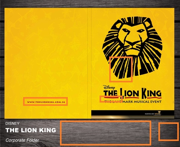
Our subject image for today :

Image Source
The image above was created by Milin John, a senior designer based in Singapore.
I appreciate the fact the the brochure portfolio has a minimalist design relevant with the musical event. We should applaud the designer for that part.
DISSECTION
Contrast

It’s interesting how the contrast is simple yet enigmatic to the eyes of the viewer. As seen on the brochure, the warm colored underlines made perfect contrast with the dark bold text. And as for the corporate folder outline below, the subtle contrast made the presentation look classy in spite of the minimalist design.
Repetition
The repetition effectively highlighted the main theme of the brochure by focusing the eye of its viewer on the title itself, whilst assuring that the viewer interconnect the color of the repetitions with the lonesome link on the left side.
— Isn’t that some smart design engineering eh?
Alignment
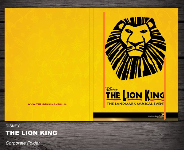
The alignment reassured the logo, trademark, title, and its theme is all in the same sighting, as the information stated are relevant and interconnected to each other. While making the company that’s running the musical event to be located on the bottom right side a bit off with the centered alignment. The purpose is to make a distinction from the main theme, as they’re the one’s responsible from the operations & marketing, and not the material itself that viewer is solely interested at.
Proximity
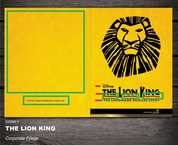
The proximity of the texts highlighted with the red lines shows the relevancy of the information (trademark, title, and theme). As for the green highlights, it shows there that there’s a huge empty space that wasn’t maximized, making the link for the event quite at risked, but in spite of the link’s far proximity from the title, the color of the link has the same color as the title highlights, making sure that the viewer’s eye would relate the title and the link together.
Color

The color complements are perfect. As you can see, there’s warm orange, mixed together with yellow, and bold black, which reflects the theme of being in a desert safari and the dark reality on the plot where in Simba struggles within the process of Circle of Life to become the new king of his home, versus Scar.
Wrapping Things Up
Prior to being a visual media student: the concept regarding contrast, repetitionn, alignment, prox-imity, and color seemed to be irrelevant and menial. But after settling upon the importance of the relevancy and organization of information, attention to detail, and attention span of the viewer, I then realized how important are these five elements in making effective visuals.
