
Source: https://australiamovie.livejournal.com/32449.html
Publisher: Men’s Health
The magazine spread above is a perfect example of good typography and photography. Later on this article, we’ll dissect its bits and details to have a good scope of the example magazine spread’s good typography and photography techniques.
PHOTOGRAPHY
Rule of Thirds

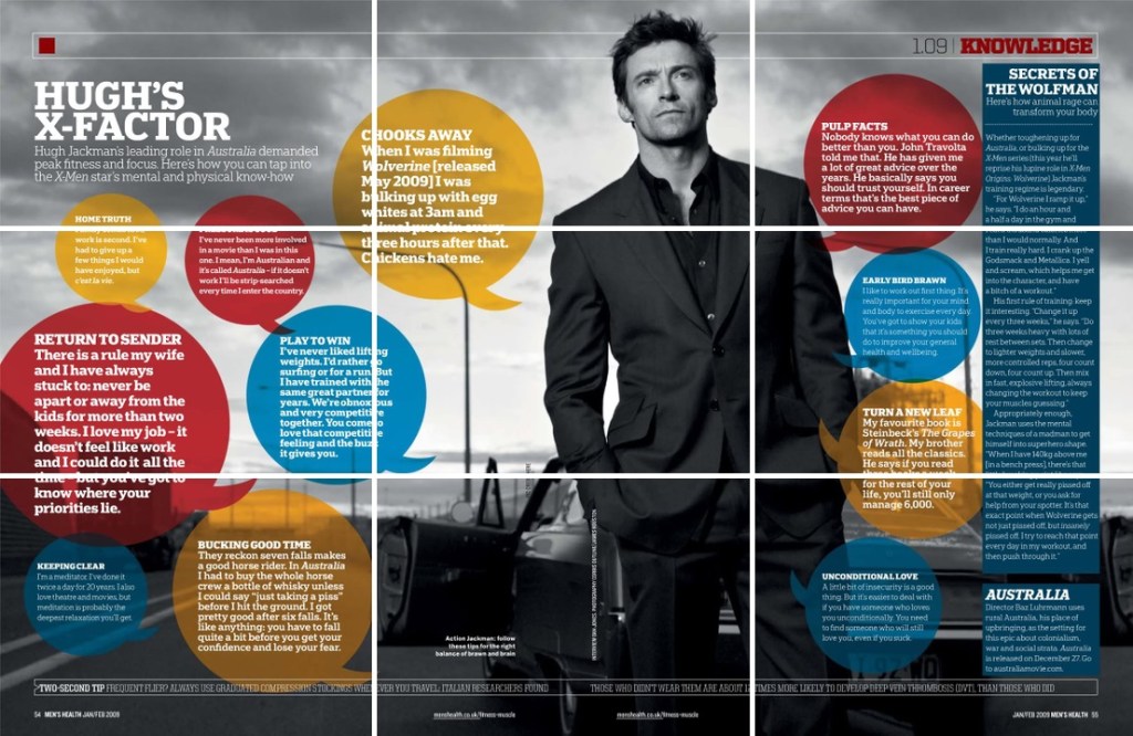
The magazine spread is a good example of the “Rule of thirds“. Rule of thirds is a usual photography technique for adding more tension and power in the subject. As what we can observe from the top, the subject is the famous Hollywood star Hugh Jackman, also known as The Wolfman or Weapon X— A.K.A. Wolverine, which is known for being the battle ready adamantium enforced superhero, and the core character of The X-Men. Using the Rule of thirds in this example have effectively enforced the strong theme of the subject.
Leading Lines
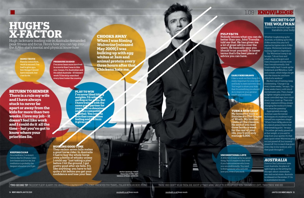
“Leading Lines” as shown by the white draw-overs might be subtle to the eye, but the aesthetics of the lamp posts behind the subject have made a subtle yet powerful tension that emphasized the famous Hollywood star.
TYPOGRAPHY
Fonts and Positioning
The chat bubbleheads, perfect positioning and proper highlighting of the topics were perfectly utilized to make it seem that the actor is personally talking to his audience, which I admit is neat and seamlessly executed.
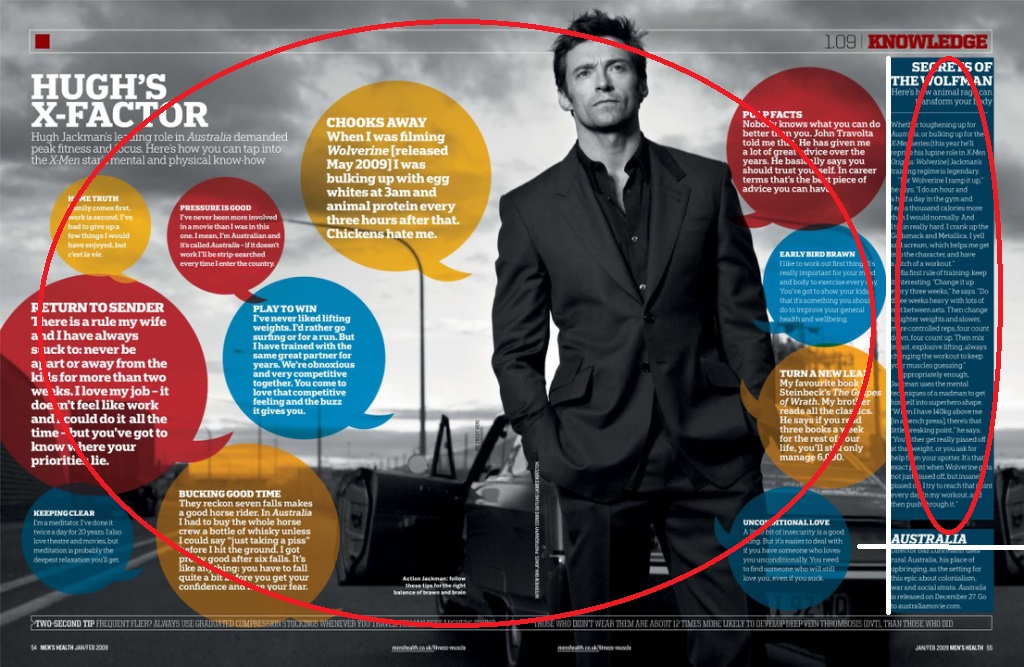
We can also see here that after all the circuses as highlighted by the red circles, we are then lead by the strong intriguing topic projected by the heading “SECRETS OF THE WOLFMAN”, where we are then lead to Hugh Jackman’s 2008 movie: Australia, thanks to the perfectly bodied fonts and solid shade that lead us to the main point of the promotional magazine spread. I also find it neat that it was positioned perfectly yet it’s font size is humble compared to the rest of the theme, which I believe is perfect in humbling down the “advertisement” feeling that is laid away from the mainstream consumers, which empowers the personalized feeling that Hollywood always offer to its joyous viewers.
AN AMATEUR’S COMPARISON
As for our amateur comparison for today, I’ve chosen our dear ChocoMucho as the subject.

Rule of Thirds
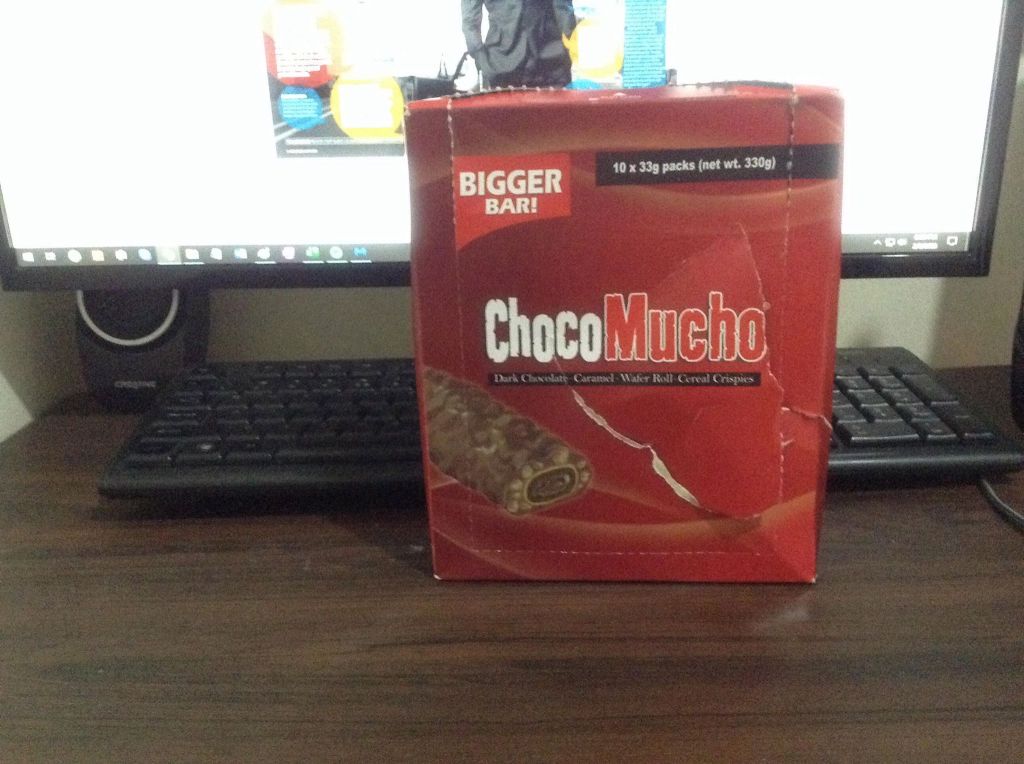
Both of the subjects were taken considering the rule of thirds to emphasize the tension and aesthetics.
Leading Lines

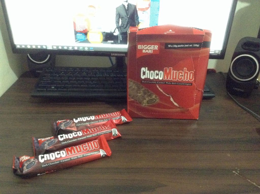
In comparison with the professional magazine spread; our subject, ChocoMucho, seamlessly manipulated the use of Lead Lines by placing the three choco bars so that we can somewhat manipulate our eyes to the amateur subject.
Highlighting The Theme


The oval draw-over basically shows how the headings were perfectly used to emphasize how bigger, huge, and manly the subjects are.
WRAPPING THINGS UP

Looking at images like the one above might really seem simple and casual to us the consumers, but in reality, it’s fascinating how simple photography and typography techniques were perfectly utilized to layout a good example of a marketing masterpiece that perfectly projects aesthetics and confidence .
