
In today’s blog, we’ll talk about the reverse engineering of creative ad that I’ve made in Visual Media class. We’ll compare the techniques use in the original Ad that I’ve found on the internet with respect to Fair Use Policy, and the creative ad the I’ve personally made for the course.
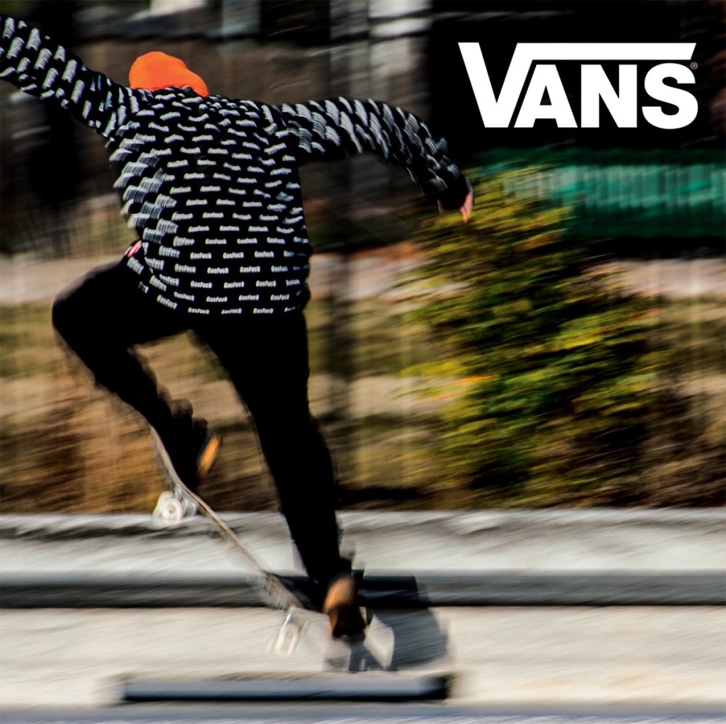
Here’s the original VANS ad that I’ve found here in this link made by Dana D’Antonio, an artist and graphic designer with a very interesting taste in visual arts. Her style seems to be a mix of modern, abstract and class.
Now let’s disseminate the ad with the interesting visual techniques used by the artist.
Depth
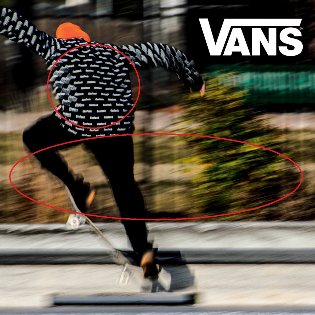
On the circles above, we can see that in general they’re distorted to give it a perception that the image is moving. And if we look closer, the jacket of subject has a much more composed imagery compared to the background, which makes the illusion that the jacket is closer to us, while the ones with more distortion are further than the subject.
Proximity
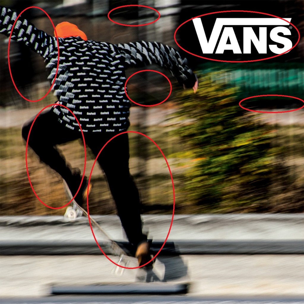
The proximity of the dark colors on the visual ad made the VANS brand logo perfectly blended with the imagery. It feels like that the logo wasn’t forced, and its visual energy highly relevant with the freedom and fast paced movement of the subject that is riding the skateboard.
Leading Lines
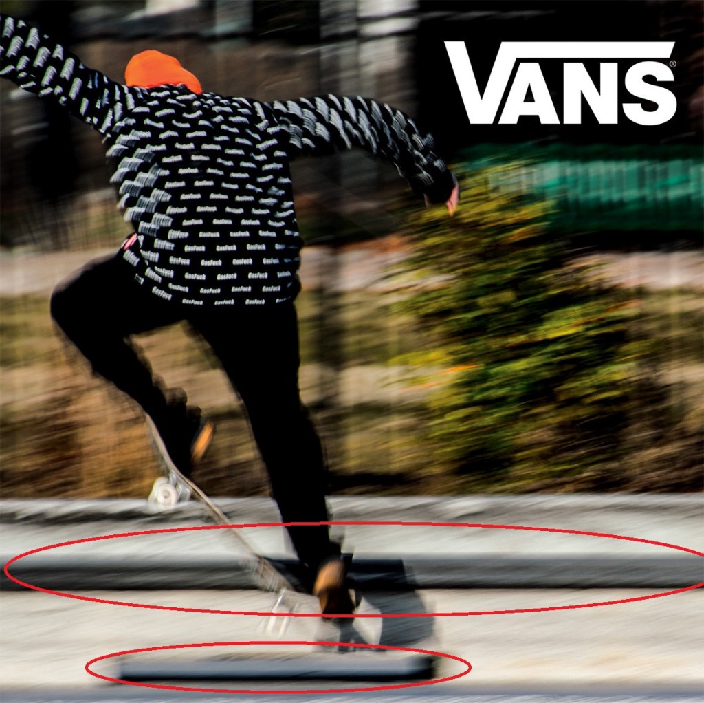
If we look closely below— lines were used to add story to the image. On the lowest line, it shows that the skater jumped from an obstacle; while the upper line portrayed that a long adventure awaits for the skater while surpassing the road block. This detail could be subtle, but this type of little details added an interesting story that we might probably make subconscious judgement on the visuals, making the visual ad more appealing even without further specifying.
Now let’s talk about the ad that I created for Visual Media course.

I got this ad from a public domain site uploaded by kai Stachowiak. You can check more of his stuff here.
I made the image above as we were instructed to make a visual media that would look like that it came from the same set of advertisement as the first subject.
Texture

I selected the font style “Viner Hand ITC” because it connects with the gritty texture of skateboarder’s gritty texture. Maybe in my revision of this visual ad, I might probably make the texts grittier to make it more connected with the subject.
Colors
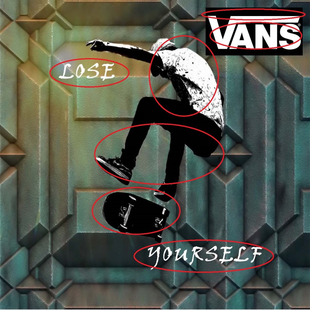
The colors of the font and the skateboarder are mainly composed of black and white, which is relevant to our brand logo’s colors. In that way, we can put the receiver’s perception that the subject or the viewers themselves totally carries the brand’s influence while they wear the apparel, which is a feel good factor for the consumer and for the brand’s sales metrics.
Contrast and Depth

The abstraction of both the subject and the background aren’t blended very well, making it seem like that the subject have this sort of an autonomy and uniqueness that he carries along with the branded apparel the he wears.
Conclusion
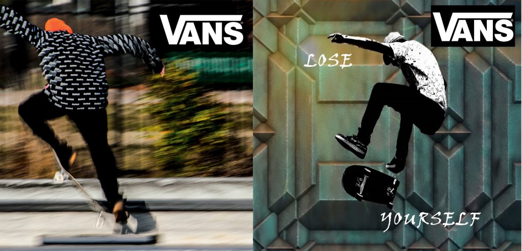
Viewing ads might seem simple in the normal eye, but specifying the smallest details of the visuals that we see in a day-to-day basis can practice us in seeing the psychological details of such image and the effects that the artist would like to produce for the consumers.

