Be yourself; Everyone else is already taken.
— Oscar Wilde.
This is the first post on my new blog. I’m just getting this new blog going, so stay tuned for more. Subscribe below to get notified when I post new updates.
Be yourself; Everyone else is already taken.
— Oscar Wilde.
This is the first post on my new blog. I’m just getting this new blog going, so stay tuned for more. Subscribe below to get notified when I post new updates.

In today’s blog, we’ll talk about the reverse engineering of creative ad that I’ve made in Visual Media class. We’ll compare the techniques use in the original Ad that I’ve found on the internet with respect to Fair Use Policy, and the creative ad the I’ve personally made for the course.

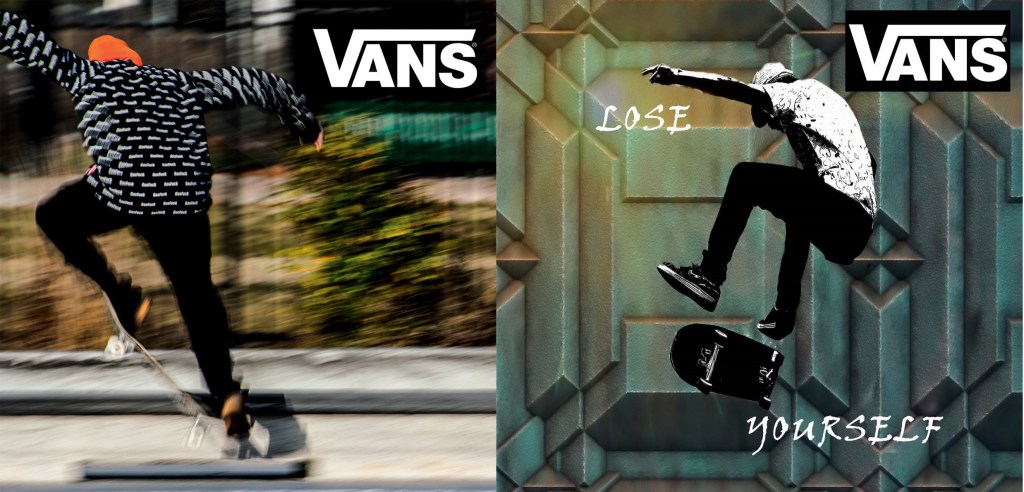
Here’s the original VANS ad that I’ve found here in this link made by Dana D’Antonio, an artist and graphic designer with a very interesting taste in visual arts. Her style seems to be a mix of modern, abstract and class.
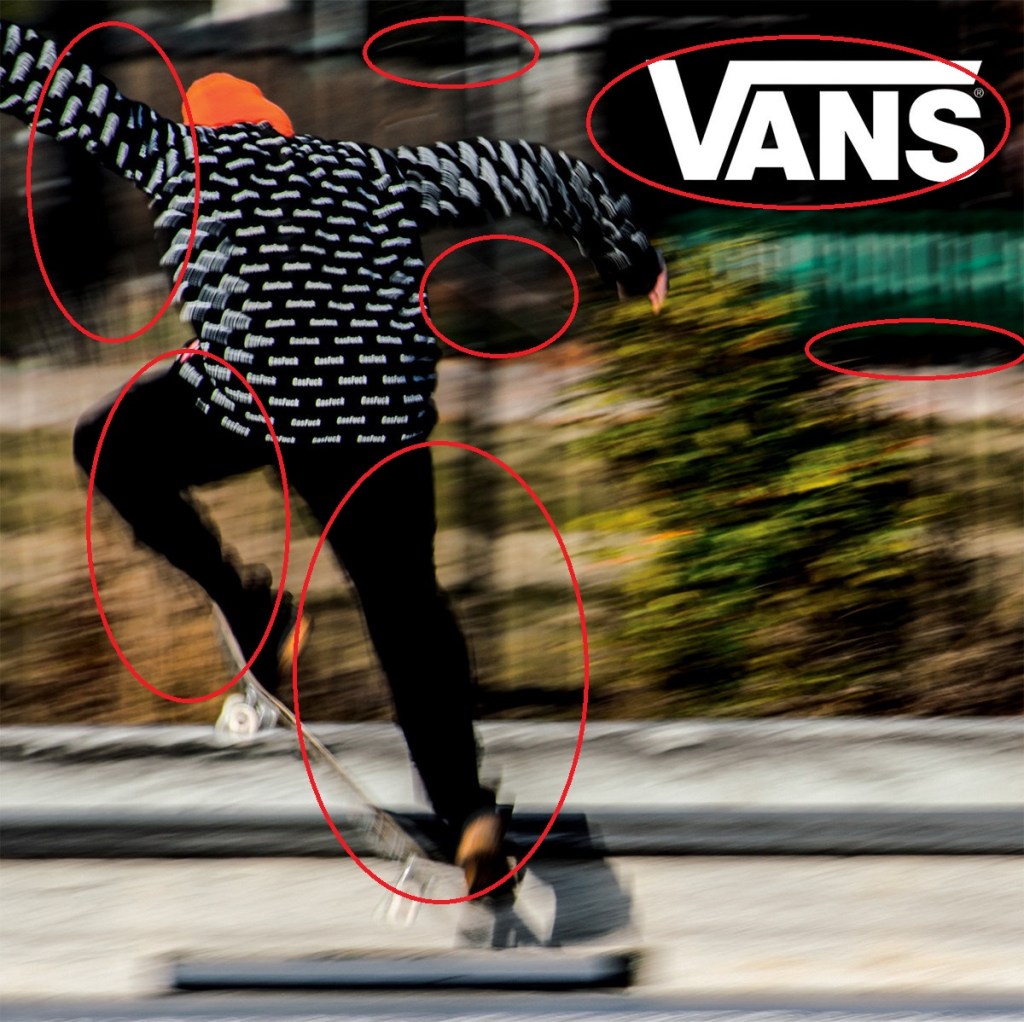
Now let’s disseminate the ad with the interesting visual techniques used by the artist.
Depth
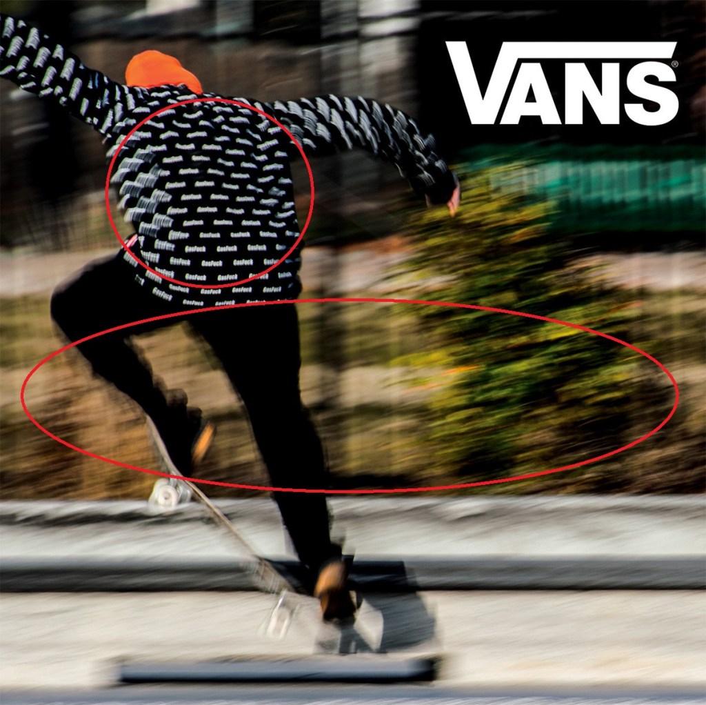
On the circles above, we can see that in general they’re distorted to give it a perception that the image is moving. And if we look closer, the jacket of subject has a much more composed imagery compared to the background, which makes the illusion that the jacket is closer to us, while the ones with more distortion are further than the subject.
Proximity
The proximity of the dark colors on the visual ad made the VANS brand logo perfectly blended with the imagery. It feels like that the logo wasn’t forced, and its visual energy highly relevant with the freedom and fast paced movement of the subject that is riding the skateboard.
Leading Lines
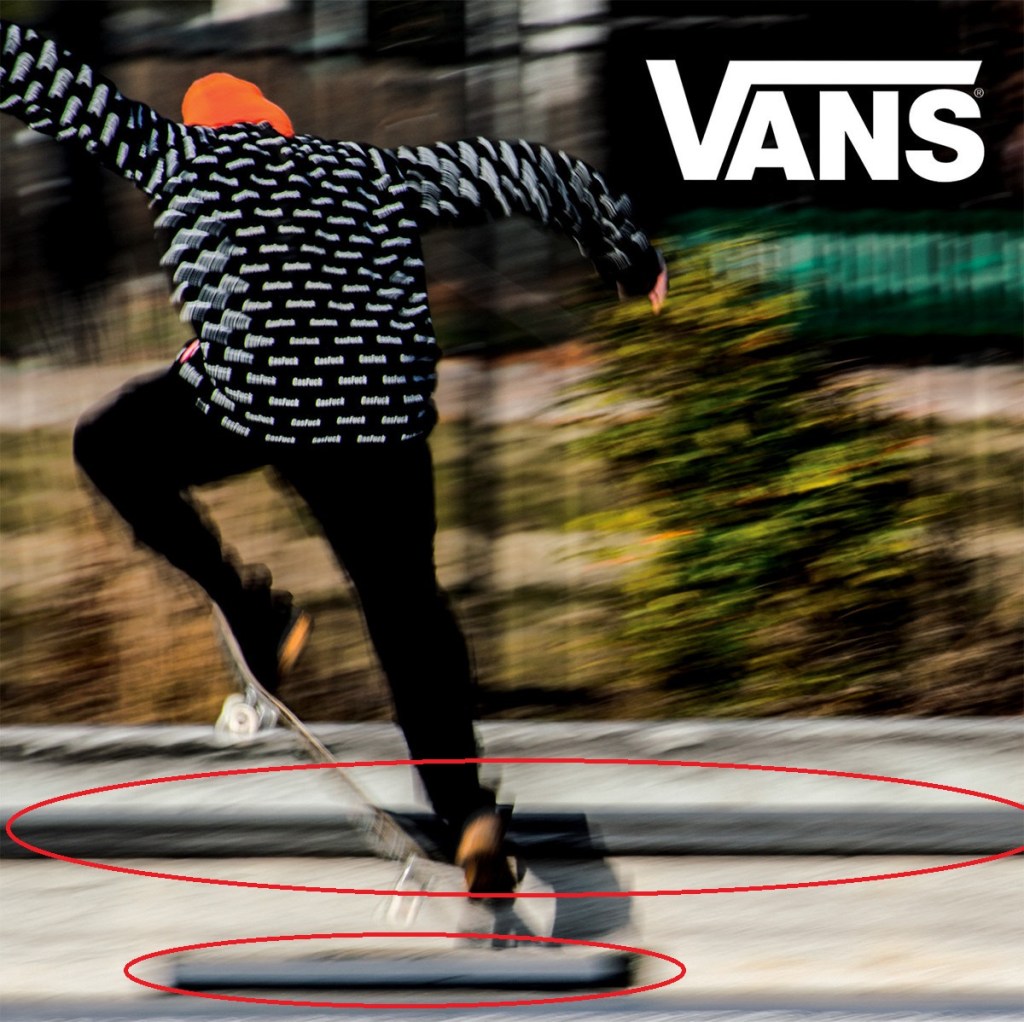
If we look closely below— lines were used to add story to the image. On the lowest line, it shows that the skater jumped from an obstacle; while the upper line portrayed that a long adventure awaits for the skater while surpassing the road block. This detail could be subtle, but this type of little details added an interesting story that we might probably make subconscious judgement on the visuals, making the visual ad more appealing even without further specifying.
Now let’s talk about the ad that I created for Visual Media course.

I got this ad from a public domain site uploaded by kai Stachowiak. You can check more of his stuff here.
I made the image above as we were instructed to make a visual media that would look like that it came from the same set of advertisement as the first subject.
Texture

I selected the font style “Viner Hand ITC” because it connects with the gritty texture of skateboarder’s gritty texture. Maybe in my revision of this visual ad, I might probably make the texts grittier to make it more connected with the subject.
Colors
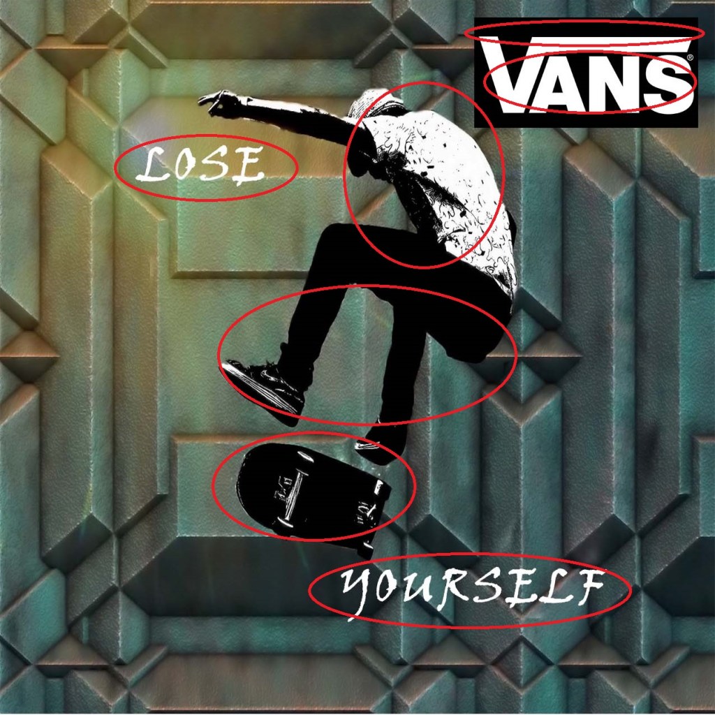
The colors of the font and the skateboarder are mainly composed of black and white, which is relevant to our brand logo’s colors. In that way, we can put the receiver’s perception that the subject or the viewers themselves totally carries the brand’s influence while they wear the apparel, which is a feel good factor for the consumer and for the brand’s sales metrics.
Contrast and Depth

The abstraction of both the subject and the background aren’t blended very well, making it seem like that the subject have this sort of an autonomy and uniqueness that he carries along with the branded apparel the he wears.
Conclusion
Viewing ads might seem simple in the normal eye, but specifying the smallest details of the visuals that we see in a day-to-day basis can practice us in seeing the psychological details of such image and the effects that the artist would like to produce for the consumers.

Source: https://australiamovie.livejournal.com/32449.html
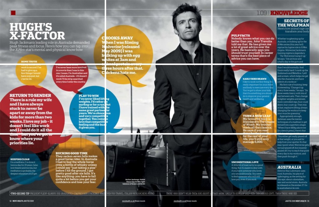
Publisher: Men’s Health
The magazine spread above is a perfect example of good typography and photography. Later on this article, we’ll dissect its bits and details to have a good scope of the example magazine spread’s good typography and photography techniques.
PHOTOGRAPHY
Rule of Thirds

The magazine spread is a good example of the “Rule of thirds“. Rule of thirds is a usual photography technique for adding more tension and power in the subject. As what we can observe from the top, the subject is the famous Hollywood star Hugh Jackman, also known as The Wolfman or Weapon X— A.K.A. Wolverine, which is known for being the battle ready adamantium enforced superhero, and the core character of The X-Men. Using the Rule of thirds in this example have effectively enforced the strong theme of the subject.
Leading Lines
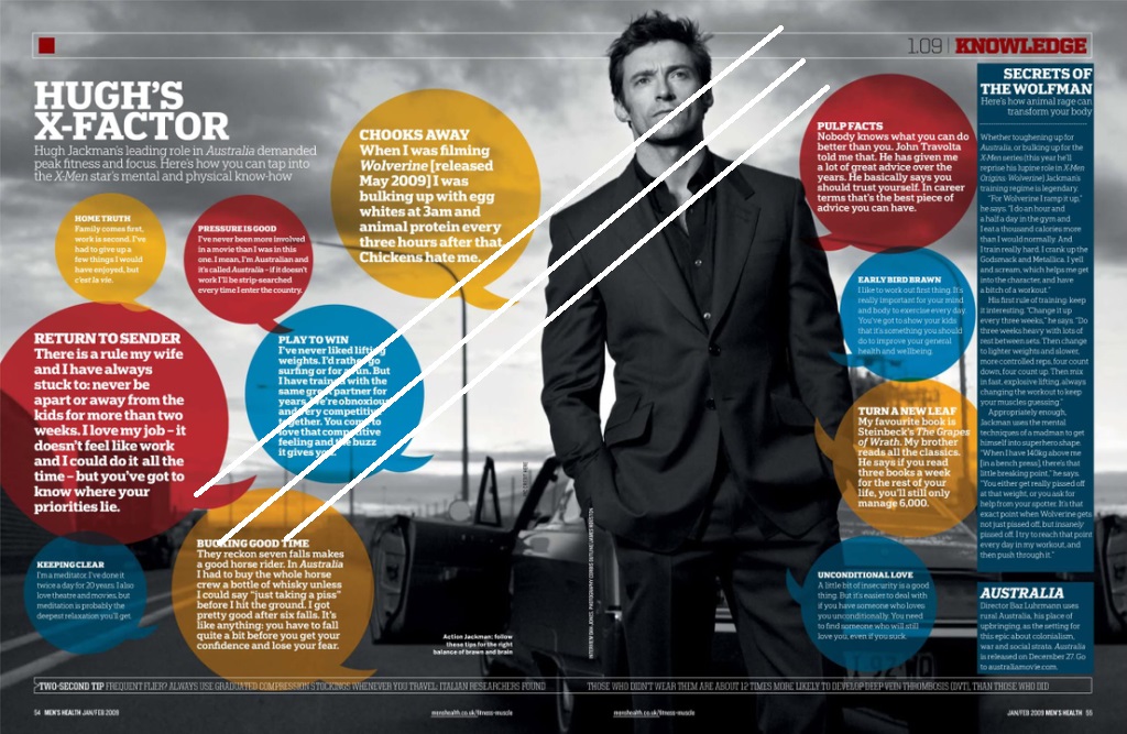
“Leading Lines” as shown by the white draw-overs might be subtle to the eye, but the aesthetics of the lamp posts behind the subject have made a subtle yet powerful tension that emphasized the famous Hollywood star.
TYPOGRAPHY
Fonts and Positioning
The chat bubbleheads, perfect positioning and proper highlighting of the topics were perfectly utilized to make it seem that the actor is personally talking to his audience, which I admit is neat and seamlessly executed.
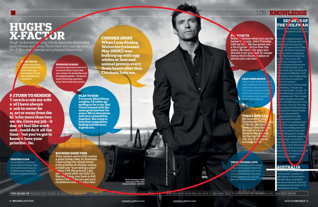
We can also see here that after all the circuses as highlighted by the red circles, we are then lead by the strong intriguing topic projected by the heading “SECRETS OF THE WOLFMAN”, where we are then lead to Hugh Jackman’s 2008 movie: Australia, thanks to the perfectly bodied fonts and solid shade that lead us to the main point of the promotional magazine spread. I also find it neat that it was positioned perfectly yet it’s font size is humble compared to the rest of the theme, which I believe is perfect in humbling down the “advertisement” feeling that is laid away from the mainstream consumers, which empowers the personalized feeling that Hollywood always offer to its joyous viewers.
AN AMATEUR’S COMPARISON
As for our amateur comparison for today, I’ve chosen our dear ChocoMucho as the subject.
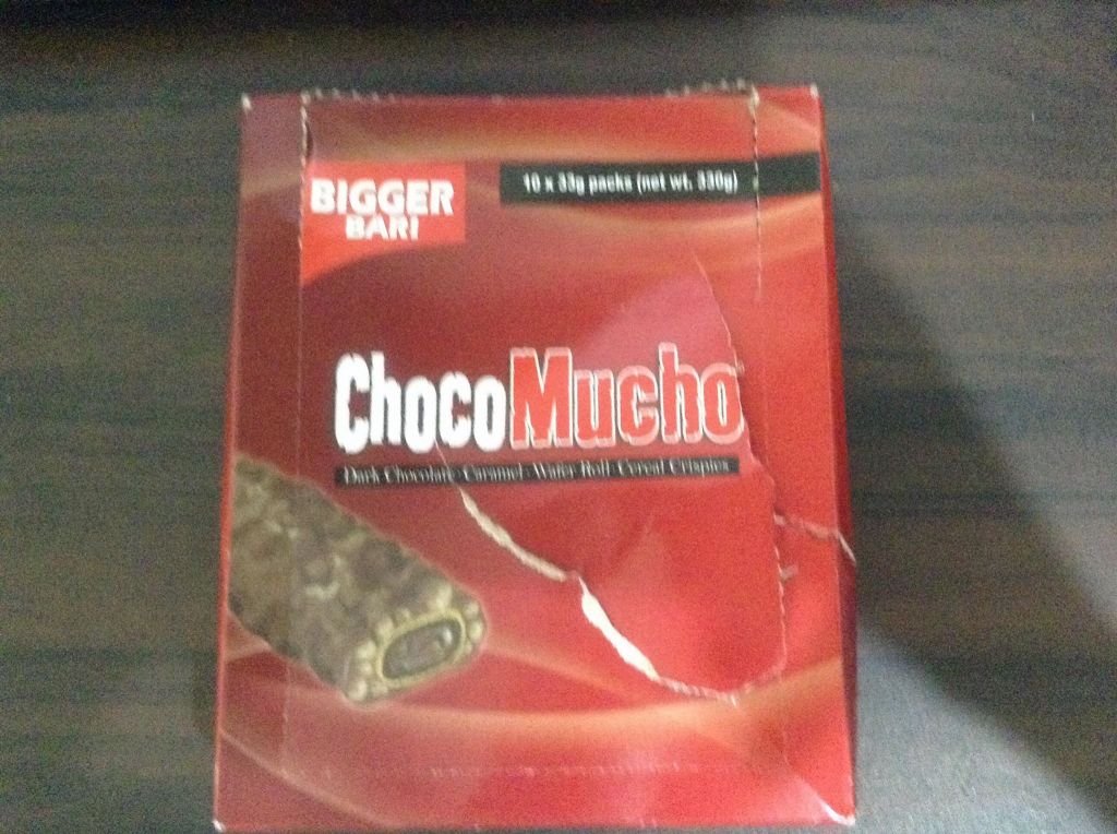
Rule of Thirds
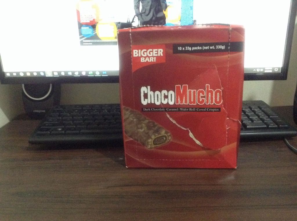
Both of the subjects were taken considering the rule of thirds to emphasize the tension and aesthetics.
Leading Lines

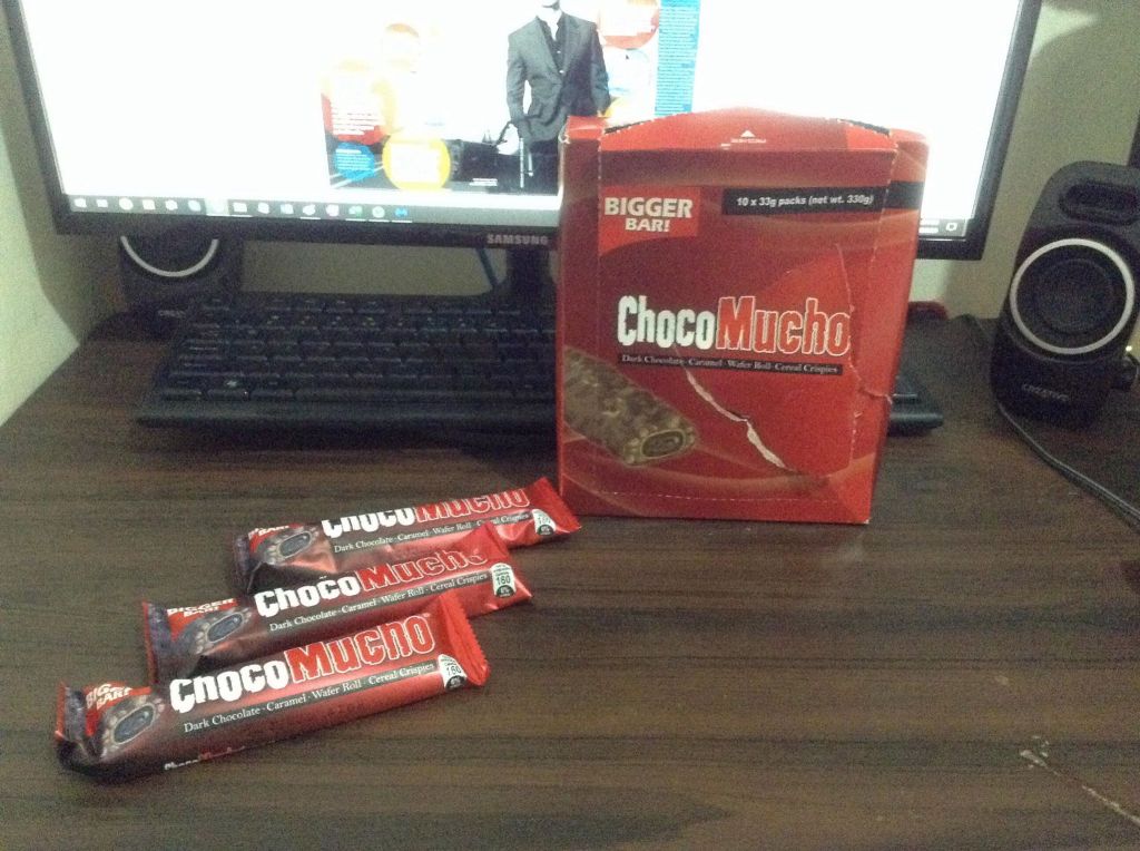
In comparison with the professional magazine spread; our subject, ChocoMucho, seamlessly manipulated the use of Lead Lines by placing the three choco bars so that we can somewhat manipulate our eyes to the amateur subject.
Highlighting The Theme


The oval draw-over basically shows how the headings were perfectly used to emphasize how bigger, huge, and manly the subjects are.
WRAPPING THINGS UP

Looking at images like the one above might really seem simple and casual to us the consumers, but in reality, it’s fascinating how simple photography and typography techniques were perfectly utilized to layout a good example of a marketing masterpiece that perfectly projects aesthetics and confidence .

Here’s my first ever analysis and drawover as a visual media student that is experimenting on design theories and eye pleasers. The focus of this reverse engineer article is to dissect the contrast, repetition, alignment, proximity and color of our subject image.
Our subject image for today :

Image Source
The image above was created by Milin John, a senior designer based in Singapore.
I appreciate the fact the the brochure portfolio has a minimalist design relevant with the musical event. We should applaud the designer for that part.
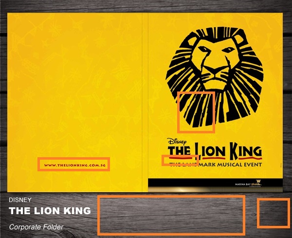
DISSECTION
Contrast

It’s interesting how the contrast is simple yet enigmatic to the eyes of the viewer. As seen on the brochure, the warm colored underlines made perfect contrast with the dark bold text. And as for the corporate folder outline below, the subtle contrast made the presentation look classy in spite of the minimalist design.
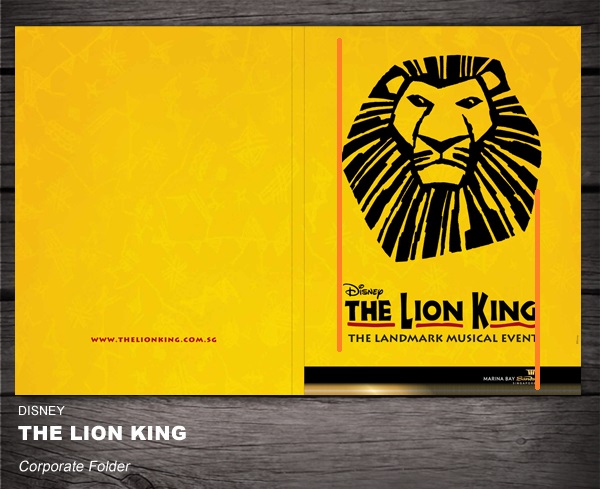
Repetition
The repetition effectively highlighted the main theme of the brochure by focusing the eye of its viewer on the title itself, whilst assuring that the viewer interconnect the color of the repetitions with the lonesome link on the left side.
— Isn’t that some smart design engineering eh?
Alignment
The alignment reassured the logo, trademark, title, and its theme is all in the same sighting, as the information stated are relevant and interconnected to each other. While making the company that’s running the musical event to be located on the bottom right side a bit off with the centered alignment. The purpose is to make a distinction from the main theme, as they’re the one’s responsible from the operations & marketing, and not the material itself that viewer is solely interested at.
Proximity
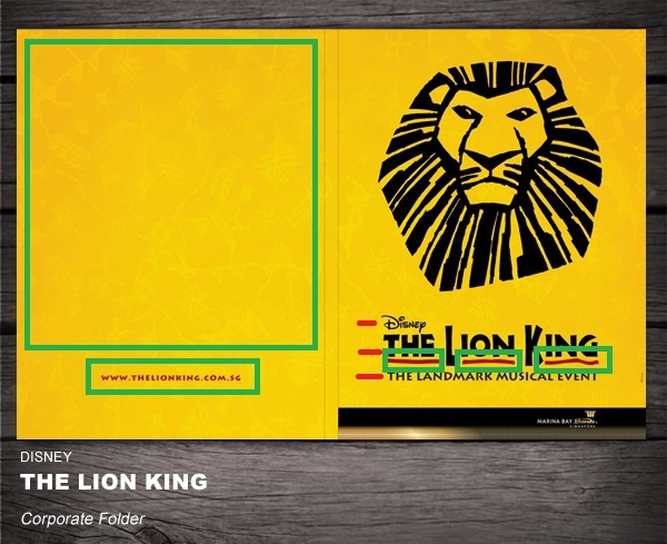
The proximity of the texts highlighted with the red lines shows the relevancy of the information (trademark, title, and theme). As for the green highlights, it shows there that there’s a huge empty space that wasn’t maximized, making the link for the event quite at risked, but in spite of the link’s far proximity from the title, the color of the link has the same color as the title highlights, making sure that the viewer’s eye would relate the title and the link together.
Color

The color complements are perfect. As you can see, there’s warm orange, mixed together with yellow, and bold black, which reflects the theme of being in a desert safari and the dark reality on the plot where in Simba struggles within the process of Circle of Life to become the new king of his home, versus Scar.
Wrapping Things Up
Prior to being a visual media student: the concept regarding contrast, repetitionn, alignment, prox-imity, and color seemed to be irrelevant and menial. But after settling upon the importance of the relevancy and organization of information, attention to detail, and attention span of the viewer, I then realized how important are these five elements in making effective visuals.
This is an example post, originally published as part of Blogging University. Enroll in one of our ten programs, and start your blog right.
You’re going to publish a post today. Don’t worry about how your blog looks. Don’t worry if you haven’t given it a name yet, or you’re feeling overwhelmed. Just click the “New Post” button, and tell us why you’re here.
Why do this?
The post can be short or long, a personal intro to your life or a bloggy mission statement, a manifesto for the future or a simple outline of your the types of things you hope to publish.
To help you get started, here are a few questions:
You’re not locked into any of this; one of the wonderful things about blogs is how they constantly evolve as we learn, grow, and interact with one another — but it’s good to know where and why you started, and articulating your goals may just give you a few other post ideas.
Can’t think how to get started? Just write the first thing that pops into your head. Anne Lamott, author of a book on writing we love, says that you need to give yourself permission to write a “crappy first draft”. Anne makes a great point — just start writing, and worry about editing it later.
When you’re ready to publish, give your post three to five tags that describe your blog’s focus — writing, photography, fiction, parenting, food, cars, movies, sports, whatever. These tags will help others who care about your topics find you in the Reader. Make sure one of the tags is “zerotohero,” so other new bloggers can find you, too.
